Introduction
Imagine you have two tests, Test A and Test B, with maximum possible scores of 720 and 100, respectively. You want to compare the scores of a student who scored 600 on Test A and 80 on Test B.
Since the maximum marks for the two tests are different, it's not immediately clear how well the student performed on each test relative to the maximum possible score. This is where z-scores come in.
That is where the concept of Z scores come in. It helps us in comparing the values which are not measured in the same way ( Scoring a score of 90 on Test B might be an achievement but we can't say same for Test A.
Comparing two quantities having different scale
Now, if we wish to compare them, we would have to bring them down to the same scale. Assuming that the distributions follow normal distribution, We do this in two steps:
Centre the distributions around the mean (We do this by subtracting Mean value from each data point)
Calculate How many standard deviations away each data point Is from the mean.
so our new value for each data point can be written as
$$\frac{Xi-x̄}{s}$$
Where xi is our data value,
x̄ is sample mean
s is sample standard deviations
This distance of a data point from mean in terms of standard deviation is known as Z-score.
Z-Score
A z-score measures how many standard deviations a particular data point is away from the mean of the dataset. It standardizes data, allowing us to compare values from different distributions.
Z-scores help identify how unusual or typical a data point is within a dataset. A positive z-score indicates a value above the mean, while a negative z-score indicates a value below the mean.
Z-scores also help in identifying outliers and understanding the relative position of a data point within a distribution.
Percentiles
Percentiles divide a dataset into 100 equal parts, with each percentile representing a certain portion of the data.
For instance, the 75th percentile is the value below which 75% of the data falls. Percentiles help us understand the distribution of data and give context to individual data points.
They are particularly useful for comparing where a specific value stands in relation to the entire dataset, allowing us to see if a value is relatively high or low.
Interpretation and Relationship
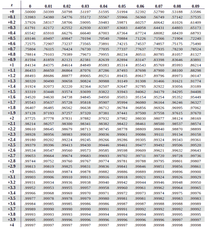
Z-scores can help determine which percentile a particular data point corresponds to in a standard normal distribution (a distribution with a mean of 0 and a standard deviation of 1) using Z table.
This is because in a standard normal distribution, the z-score directly corresponds to the percentile.
For example, in a standard normal distribution:
A z-score of 0 corresponds to the 50th percentile (the median).
A z-score of -1 corresponds roughly to the 16th percentile.
A z-score of 1 corresponds roughly to the 84th percentile.
However, in distributions other than the standard normal distribution, the relationship between z-scores and percentiles is not as direct. You can use z-scores to calculate percentiles and vice versa, but the precise conversion depends on the characteristics of the specific distribution.

Practical implementation
Lets Go back to our problem of comparing the scores on Test A and on Test B and write a python code to Visualize it.
import matplotlib.pyplot as plt
import numpy as np
from scipy.stats import zscore

# Student's scores
student_score_a = 600
student_score_b = 80

# Test maximum scores
max_score_a = 720
max_score_b = 100

# Generate random data for Test A and Test B distributions
np.random.seed(42)
data_test_a = np.random.normal(student_score_a, max_score_a/6, 1000)
data_test_b = np.random.normal(student_score_b, max_score_b/6, 1000)

# Calculate z-scores for the student's scores
z_score_a = (student_score_a - np.mean(data_test_a)) / np.std(data_test_a)
z_score_b = (student_score_b - np.mean(data_test_b)) / np.std(data_test_b)

# Create histograms
plt.figure(figsize=(12, 5))

plt.subplot(1, 2, 1)
plt.hist(data_test_a, bins=30, alpha=0.7, color='blue')
plt.axvline(student_score_a, color='red', linestyle='dashed', linewidth=2, label='Student Score')
plt.title('Test A Distribution')
plt.xlabel('Scores')
plt.ylabel('Frequency')
plt.legend()

plt.subplot(1, 2, 2)
plt.hist(data_test_b, bins=30, alpha=0.7, color='green')
plt.axvline(student_score_b, color='red', linestyle='dashed', linewidth=2, label='Student Score')
plt.title('Test B Distribution')
plt.xlabel('Scores')
plt.ylabel('Frequency')
plt.legend()

plt.tight_layout()
plt.show()

# Print z-scores
print(f"Z-score for Test A: {z_score_a:.2f}")
print(f"Z-score for Test B: {z_score_b:.2f}")
This code generates random data to simulate the distributions of Test A and Test B scores, creates histograms to visualize the distributions, and then calculates and prints the z-scores for the student's scores. The dashed red line indicates the student's score in each distribution

Both have negative z-score. It means that student scored lowered marks than average on both tests.
In summary, z-scores and percentiles play crucial roles in statistics by enabling us to interpret data in terms of its position within a distribution and facilitating meaningful comparisons between different data points or datasets.
